How to create a spinner control
Most of the commercial components of Windows Phone contain a spinner control. However, if you can afford to buy a licence, you can use the one I provide below.
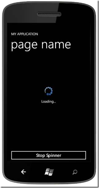
Here is a screenshot:
To include the SpinnerControl in your project, you need to:
1- Unzip SpinnerControl.zip.
2- Add the three unzipped files to your project in the root.
3- Set the build action of the Spinner.png to Content
4- Add the SpinnerControl XAML code.
If you look at my sample project, which is an empty Windows Phone application (see download link at end of blog post), you will see:
    <DotNetApp:SpinnerControl Grid.RowSpan="2"
                              IsSpinning="True"
                              Status="Loading..."
                              VerticalAlignment="Center"
                              x:Name="spinner"/>
The simple SpinnerControl that I provide contains only 2 bindable properties:
– IsSpinning: When it is set to true, the spinner rotates and it is visible. When it is set to false, the control is collapsed.
– Status: This property is optional and it is used to put text under the spinner. It is useful if you wish to display the progress.
If we look at the file in more detail, SpinnerControl.xaml has is two important parts:
1- The Storyboard to rotate the image
    <Storyboard x:Name="StoryBoardAnimateSpinner">

      <DoubleAnimation AutoReverse="False"
                       Duration="0:0:2"
                       From="0"
                       RepeatBehavior="Forever"
                       Storyboard.TargetName="SpinnerTransform"
                       Storyboard.TargetProperty="Angle"
                       To="360" />

    </Storyboard>
This storyboard can be translated to: The image will rotate through 360 degrees every two seconds at a constant rate of rotation, and will continue to rotate forever. If you wish, you can set it to rotate through 360 degrees at a different speed, for example, every five seconds instead of every two seconds. You simply need to modify the Duration property.
2- The Image
    <Image Height="50"
           Margin="10,10"
           Source="/Spinner.png"
           Stretch="Uniform"
           Width="50"
           x:Name="spinImage">

      <Image.RenderTransform>

        <RotateTransform x:Name="SpinnerTransform"
                         CenterX="25"
                         CenterY="25" />

      </Image.RenderTransform>

    </Image>
The Height and Width of spin image need to be equal, otherwise, you’ll get a weird rotation. The CenterX and CenterY need to be half the value of the Height (or Width). The image Spinner.png that I provided in the SpinnerControl is 40 x 40, but in the above code, I specified 50 x 50 and I made sure to set the Stretch property to Uniform.
The other control in the SpinnerControl is a TextBlock which you probably know. You can configure it with your own values and you can even add dependency properties to the control to make it more general.
Download SpinnerControl
Download Sample project

Jun 13, 2012 @ 14:28:02
Thanks a lot, excellent!!
Jun 13, 2012 @ 19:09:12
You’re welcome!
Nov 09, 2012 @ 13:05:28
hey can u PM me here https://www.facebook.com/dexter467Labs
i need some help in apps! thanks 🙂